The Art of The Tea Towels – THE 1960s
2020-05-12
The Art of The Tea Towels – THE 1980s
2020-07-29
‘There was a move towards graphic design and illustration; it was very much part of the times-everyone was designing tea towels. ’
IAN LOGAN,GRAPHIC DESIGNER
SEVERAL disparate threads informed the design aesthetic of the 1970s. These shared a commonality by being rooted in the past, from the tightly organized patterns inspired by Owen Jones from his treatise on the decorative arts, The Grammar of Ornament, published in 1856, to a continuing interest in an augmented William Morris style, infected with psychedelia. The 1970s kitchen also reflected this upsurge in nostalgia, with the introduction of wholesome, natural materials, such as hand-woven baskets, vintage kitchenalia and antique floral jugs, to the domestic interior. In 1975, during a period active with the second wave of feminism as women aspired to eschew the submissive domestic role, the English writer Shirley Conran published the book Superwoman, aimed at busy women, coining the phrase ‘Life is too short to stuff a mushroom’. Ironically, women donned dainty floral frills and pinafores as the faux country house ‘below stairs’ design revivalism intensified.
Any Modernism of the previous decade was largely replaced by a fully-fledged desire to return to nature, with images evoking a rural past that only existed in some imaginary golden age. This was typified by Welsh-born designer, Laura Ashley, who popularized small retro florals, drawn from her personal archive of early 19th-century printed cotton fabric samples. The commercial success of her earlier designs, based on Victorian playbills, prompted Ashley to start researching other historical print sources for patterns, and it was with the advent of the 1970s that the label received global recognition for its wholesale homage to the past. In a similar vein, Portmeirion Potteries introduced the pastoral overtones of the Botanic Garden range of decorative floral designs by Susan Williams-Ellis, the daughter of architect Sir Clough Williams-Ellis0 who built the Italianate village of Portmeirion in North Wales. Together with her husband Euan Cooper-Willis, they established the Portmeirion Potteries after they took over two small ceramics concerns, A.E. Gray Ltd and Kirkhams, in the early 1960s. First launched in 1972, ‘Botanic Garden’ was replete with illustrations adapted from Thomas Green’s Universal Herbal, or Botanical, Medical and Agricultural Dictionary (1817), and soon became a kitchen staple. A range of non-ceramic accessories, including tea towels, followed.
The Jazz Age, flappers and cocktail shakers were revisited with the resurgence of Art Deco as a trend. This was exemplified by print designer Bernard Nevil at London store Liberty and by the opening of the fourth and final Biba shop on London’s Kensington High Street. This department store offered a cinematic glamour reminiscent of 1930s Hollywood. Everything was designed to be subordinate to the overall look, from fashion and furniture to tea towels, and even the labels on tins of foodstuffs.
Many of the more successful printed-furnishing companies were convertors rather than manufacturers, taking raw, unprocessed cloth known as greige from the mills, and processing it to a finished commercial product by dyeing, printing, or other methods. This was the case with the John Lewis Partnership of which Cavendish Textiles, created in 1930 by Walter H. Halstead, was a subsidiary. It introduced tea towels to its repertoire in 1973.
Illustrator Belinda Lyon first introduced her own brand of psychedelic whimsy in the late 1960s, when Oxfam-the first UK charity to introduce a commercial model to its shops-began to sell own-brand merchandise consisting of the designer’s first two tea towels. The elephant and giraffe were initially produced in three colorways and were selected for the London Design Centre – at this time still known as the Council for Industrial Design, prior to the opening of the Design Centre shop in 1971. New designs were added to the range each year, with 20 different animals available in the series by 1979.
This period was particularly fruitful for Pat Albeck as she began her association with conservation organization The National Trust for Places of Historic Interest or Natural Beauty-or the National Trust as it is more commonly known. In an interview about her career, Pat said, ‘There were no National Trust shops then, in fact hardly any museum shops existed, it was the beginning of a new style of shopping. I was designing things that people might be tempted to buy at the end of a visit to a National Trust house or garden. This influenced my style. I was using line drawing as my work became more representational and my color became more muted, to go with the historic houses. Also, it meant I really had to learn to draw buildings accurately. Many of my designs were for specific properties, which I always visited, so I got to know a lot about the English countryside.’
The tea towel has long been associated with the holiday souvenir, a whimsical purchase, which provides a reminder of the location and is also a cheap and cheerful present for those left behind at home. Overall aesthetic direction was subverted to the designer’s need to celebrate local features; a beachfront, a funicular railway, a Ferris wheel, an aerial view of the pleasure gardens-very similar in style to the postcards on sale. Tea towels purchased in Scotland , Ireland and Wales inevitably included national emblems-the Scottish thistle,
the Welsh daffodil, the Irish shamrock, or even regional recipes such as the Cornish pasty or cawl soup from Wales. These were executed with varying degrees of graphic sophistication.
Originally a small fabric print company producing prints for fashion designers, lan Logan formed JRM Design alongside fellow graduates from the Central School of Arts ( now Central St Martins ), subsequently producing designs on cushions, tablecloths and tea towels.

Featuring all the accouterments of the newly fashionable beverage within the portals of a decorated cupboard, lan Logans design Coffee Cupboard exudes ‘ 60s graphic style overlaid with the later hippie ‘flower power’ in contrasting colors produced by vat dyeing.

The Old Bleach Linen Company opened in Randalstown in Northern Ireland in 1864. The manufacturer commissioned designs from leading artists such as Marion Dorn, Ashley Havinden and Paul Mansouroff. It was one of the first companies to screen print onto textiles.

A half-drop composition of identifiable garden species, this tea towel reasserts the value of realist clarity. It is as true to the English country garden as a vintage seed catalogue, from campanula to cyclamen and on to bellis, primrose, viola and auricula.

A playful depiction of naively drawn creatures to illuminate the biblical story of Noah’s Ark in which Noah, his family, and representatives of all the world’s animal species are saved from a cataclysmic flood. Designed in full colour by Ulster Weavers.

Dunmoy by Moygashel, a manufacturer of fine linen goods for the aristocracy founded in the 1780’s and based in the Northern Irish village of Moygashel in County Tyrone. By the mid-20th century, Moygashel linens were a high-quality brand exported across the world.

A 19th-century multi-patterned Indian textile is the inspiration for Ulster Weaver’s Museum and Galleries collection. Below a decorative spandrel, a spray of exotic red flowers fountains from a central vase, replicating an overall architectonic form shared by Hindu temples.

The artwork for a tea towel produced by Ulster Weavers with a theme suggestive of Christmas. The holly, ivy, berried yew and the Christmas rose motifs are worked into an all-over paisley design within a decorative border.

The tea towel commemorating the silver wedding anniversary of Queen Elizabeth II to Prince Philip, the Duke of Edinburgh, follows Ulster Weaver’s formal format and traditional colourway of blue and gold. A Celtic-inspired border is interspersed with a white.

To celebrate the wedding of Her Royal Highness Princess Anne to Captain Mark Phillips, Ulster Weavers followed a similar template to that of the previous design but added, for example, a prancing horse to reflect the couple’s equestrian activities.

Portmeirion’s most recognized design is the ‘Botanic Garden’ range, decorated with a variety of floral illustrations such as this lush peony bloom adapted from Thomas Green’s Universal Herbal, or Botanical, Medical and Agricultural Dictionary (1817). The range was launched in 1972.

A botanically correct drawing of Gazania rigens is framed by the distinctive band of stylized leaves familiar to lovers of the ‘Botanic Garden’ range of Portmeirion products designed by Susan Williams-Ellis.

Illustrator Belinda Lyon initially worked in advertising before developing her commercial freelance career with illustrations for short stories and books aimed mainly at children and teenagers.

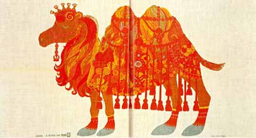
The stylized camel is drawn in typical naive style enhanced by floral decoration, and is typical of Lyon’s clean graphic style that combines‘60s Modernism and psychedelic colour contrasts of bright pink and orange with hippie ‘flower power ‘.
Redolent of a faux medievalism, and in keeping with the‘70s preoccupation with a Pre-Raphaelite aesthetic, Belinda Lyons ‘Great Lovers of the World ‘ series appeared from 1973-1976/77. Subjects included Napoleon and Josephine, Romeo and Juliet, and Antony and Cleopatra.

Notorious outlaw Robin Hood and Maid Marion appear surrounded by an intense arrangement of stylized flora and naively expressed fauna redolent of Pisanello’s The Vision of Saint Eustace. The demeanour of the protagonists conveys an uneasy amalgamation of innocence and dissipation.

Renowned for its innovative advertising, and in a bid to increase its market share by appealing to women, Guinness depicts a woman wearing a dress similar to that featured in John Singer Sargent’s Portrait of Madame X, while holding a glass of the Irish stout.

In an era familiar with the second wave of feminism, the slogan- from the film of Georg Bernard Shaw’s play Pygmalion-is a rhetorical question implying that women already have it all. The image has the resonance of artists such as Henri de Toulouse-Lautrec.

Elevating the souvenir tea towel to an art form, Pat Albeck deploys architectural drawing with a formal placement of subject matter to create an informative illustration of various Scottish castles held by The National Trust.

Designed by Pat Albeck, this tea towel shows various views of Derbyshire’ s Hardwick Hall, an architecturally significant Elizabethan country house designed by the architect Robert Smythson for the redoubtable Bess of Hardwick.

This tea towel provides a map of the main thoroughfare running through Edinburgh, the capital of Scotland. The Royal Mile details significant locations that are pertinent to the history of Scotland -in particular Edinburgh Castle and the Palace of Holyroodhouse.

A crudely executed holiday souvenir of the West Country, this tea towel nevertheless provides a sunny charm, featuring a naively described interior of a fisherman’s cottage complete with cat – and the addition of a local recipe.

Seated at a spinning wheel (Wales is renowned for its wool textiles) the woman wears the traditional National costume of Wales- red and black checked betgwn, or bedgown, shawl, white cotton fichu and the unique Welsh hat.

A souvenir tea towel featuring the Jolly Fisherman, a character first seen on a railway poster declaiming ‘Skegness is so bracing ‘, drawn by the master of the cheeky seaside postcard, graphic artist Donald McGill (1875-1962).


